Architecture Academy Competition 2014 Results
The Architecture Academy is an online training course that teaches you how to create Architecture using Blender. To test the limits of the students, we recently held an internal competition (open only to members) to see who could create the best Architecture Scene.
I was so impressed with the entries that I've decided to share them here...
Winners
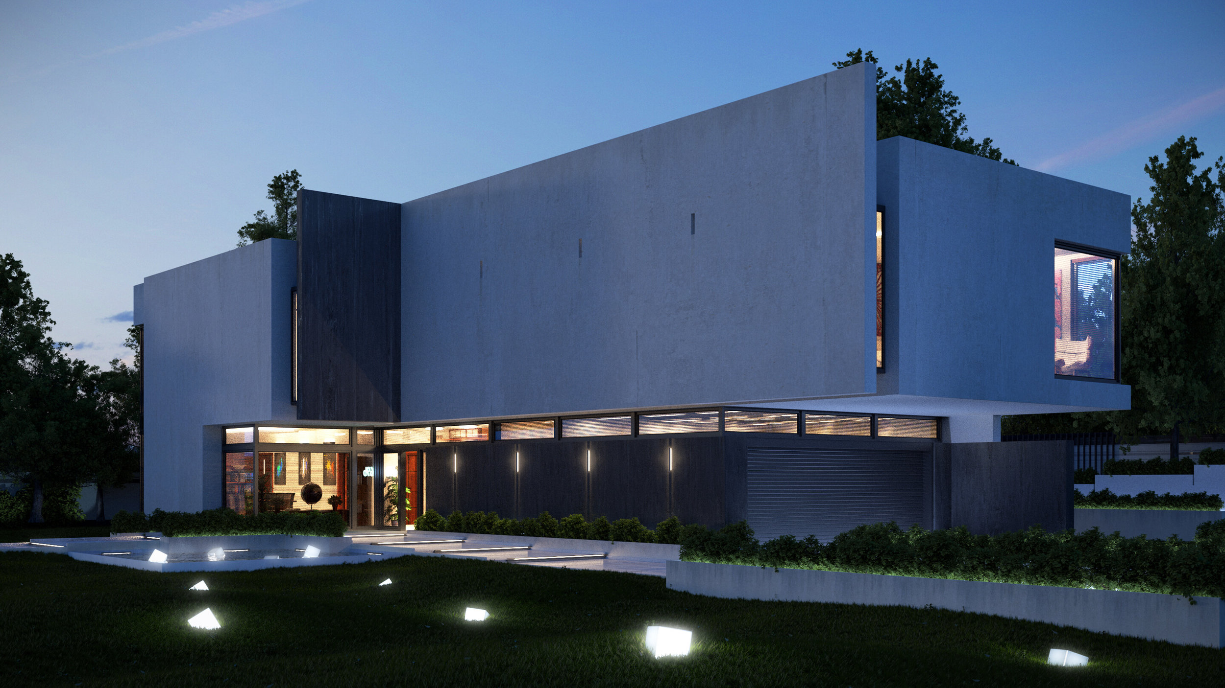
Exterior Category: Mateusz Wielgus
Beautiful! The decorative lighting across the front lawn was a brilliant choice - not only does it look stunning, but it also acts to balance the otherwise heavy dark grass. The materials on the house are nice mix of new and old with a subtle grunge and bump mapping. I could absolutely imagine these images in an architectural magazine. Well done!
Interior Category: Mason Menzies
STUNNING! I just love this scene. The lighting, soft colours and materials are all outstanding. Not only that, but the arrangement and design of the scene is really well thought out. The open floor let's viewers explore, and the nature outside gives reference and comfort. You've worked extremely hard on this scene and it shows. A well deserving first place. Congratulations!
Finalists
Exterior Category
Lars Beckmann
"Tranquility" perfectly captured. The lighting reflecting across the water is beautiful. And the bonsai island was a great touch :)
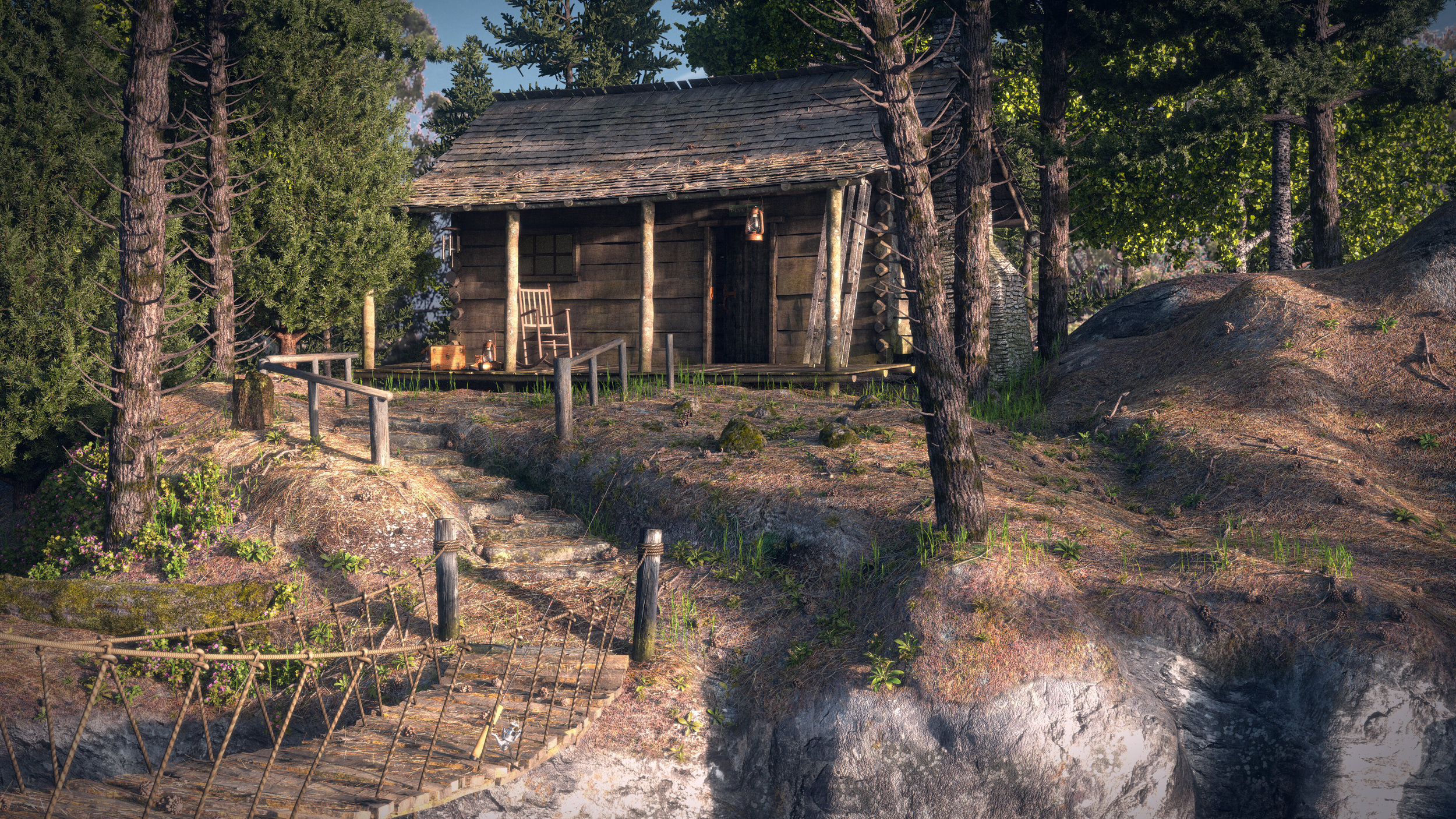
Reece Robinson
Stunning! The cabin is obviously from Module 10, but the rest of the scene is almost entirely different. I love the sparce looking dirt and weeds, and the roof of the cabin is also particularly well done. Congrats!
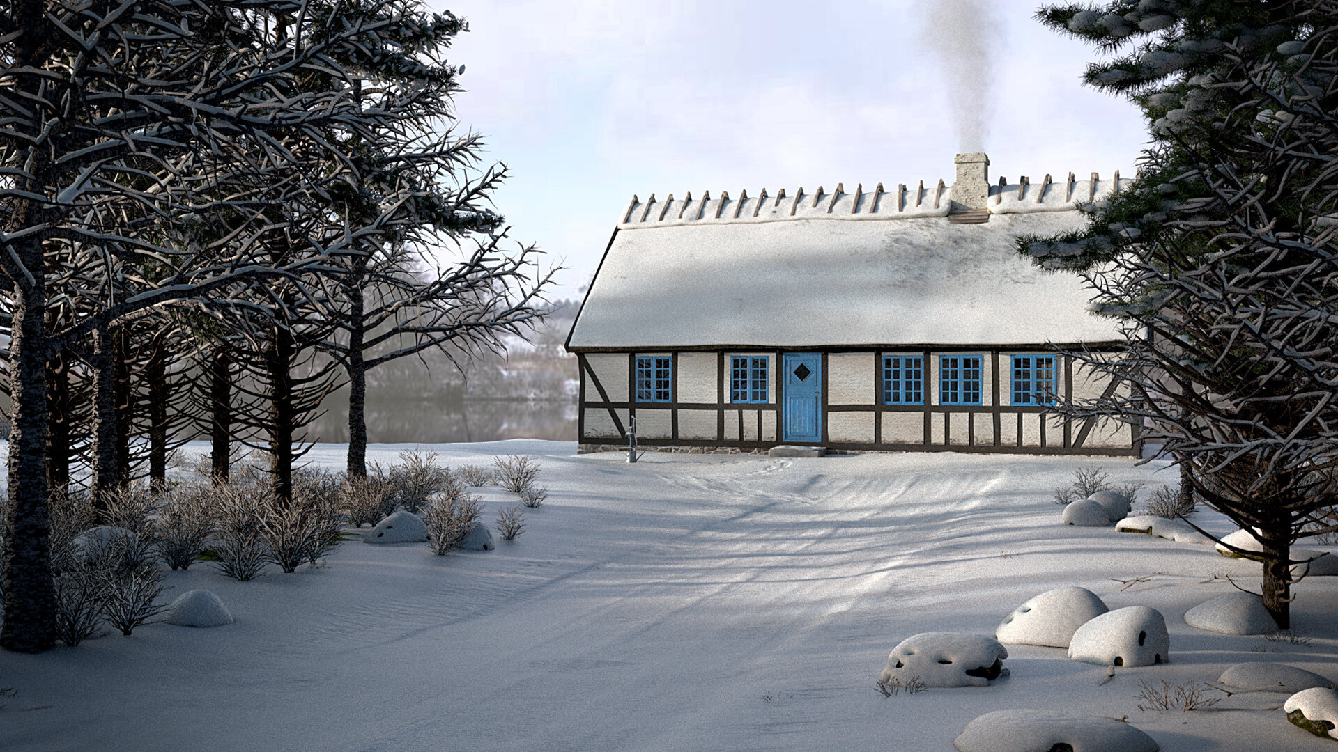
Luca Buono
The snow effects are really well done. You worked hard to blanket everything including the vegetation and rocks. Really nice scene.
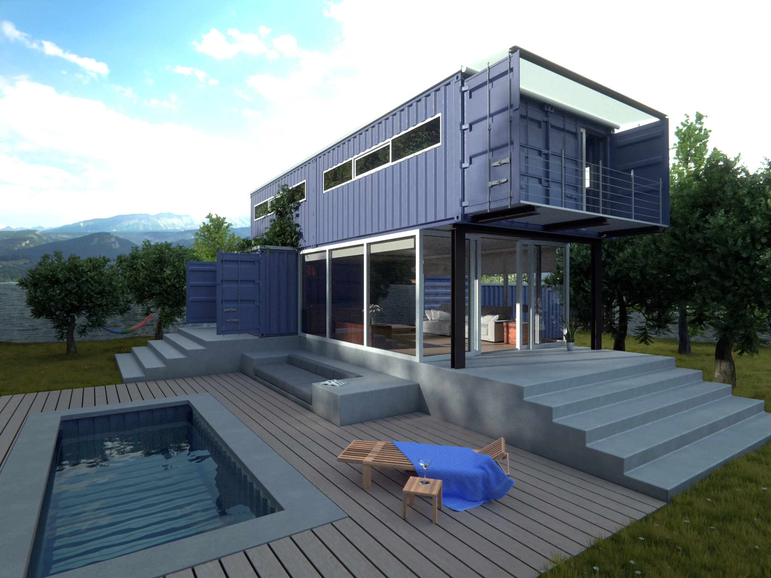
Moritz Martin
Very unique architectural design! I've heard of these shipping container houses, and am constantly amazed at how amazing they can look. And you've captured just that. It looks like an expensive modern home. Well done!
Interior Category
Cristina Ducci
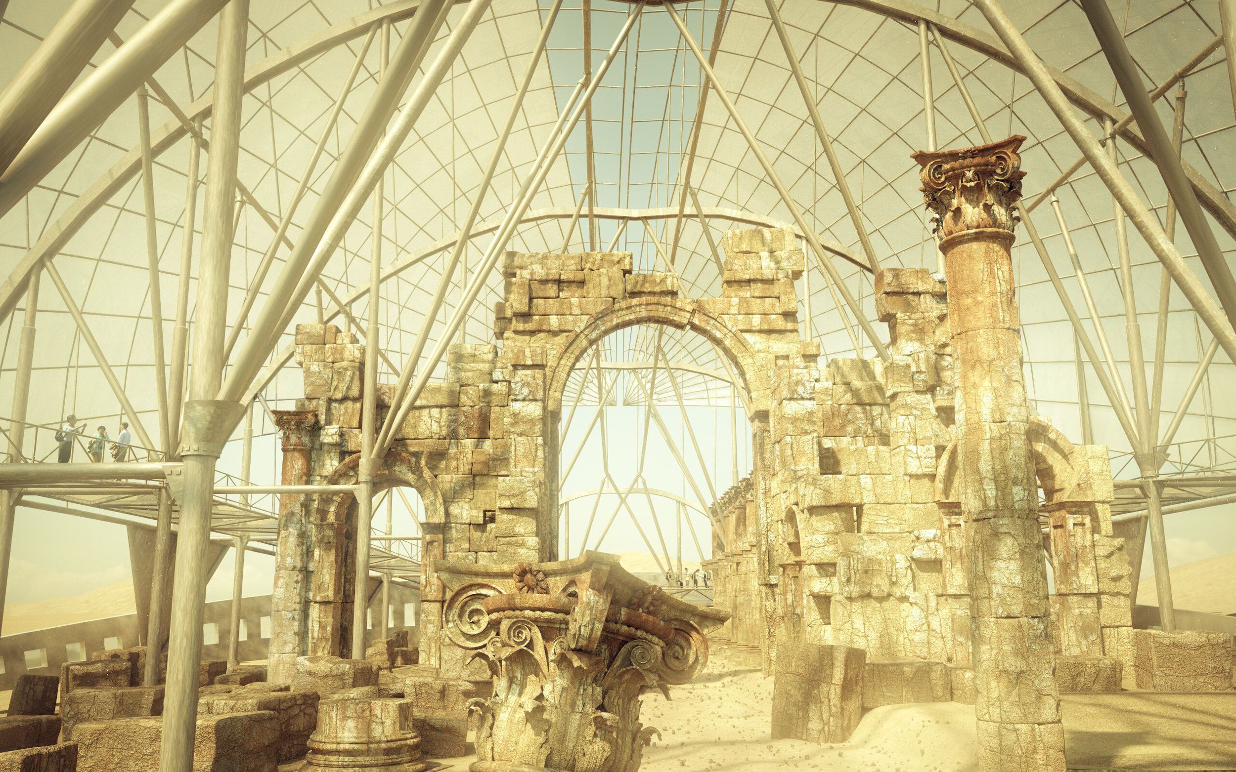
Wow. Those grungey, worn out materials are stunning. A refreshing take on museum visualizations. Well done!
Jeroen Vermunt
A very complete looking interior. There's some scaling and material issues, but overall the image looks lovely.
Luca Stampe
Wow. Love the design, materials and lighting. The biggest issue is the noise, but perhaps that was a deliberate artistic decision. The interior design is just lovely. Keep it up Luca!
Niklaus Houska
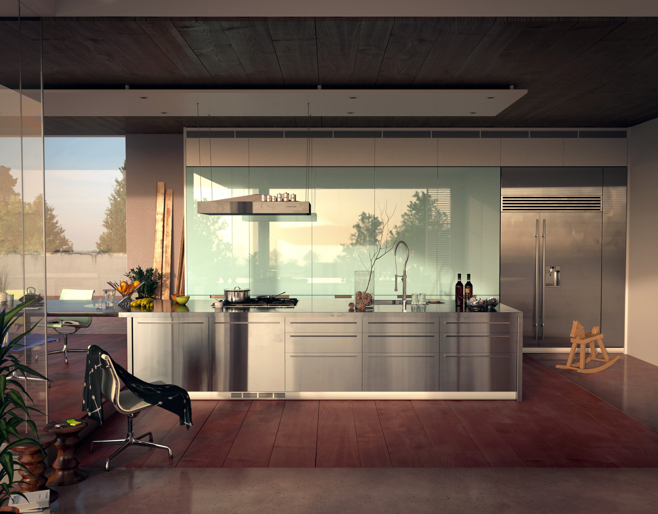
Beautiful! I love the reflections off the backboard - it helps to give it a sense of reference. And that brushed material countertop is just wonderful :)
All Entries
Some truly beautiful scenes! Really of every student that participated in the community this year :)
PS. If you're new to the site and haven't yet seen the trailer for The Architecture Academy, here it is:

