The Big Issues
With the upcoming release of Blender 2.5, the industry is now watching our every move. But how are we portraying ourselves to the outside world? In this presentation, I highlight some of the problems that are holding us back, and possible solutions on how to fix them.
Text Version
Not a fan of long videos? No problem! I've summarized the main points from the presentation and listed them below. All slides appear exactly as they are in the real presentation.
Intro
In this presentation I will be discussing the Big Issues – What we are doing wrong. The point of this talk is to raise some issues that we as a community are doing poorly and to provide possible solutions. The point is talk is not to simply point out flaws, but to bring them to the attention of the community so that we can act on them.
There are four main issues that I will discuss in this presentation.
Issue #1: Unclear Goals
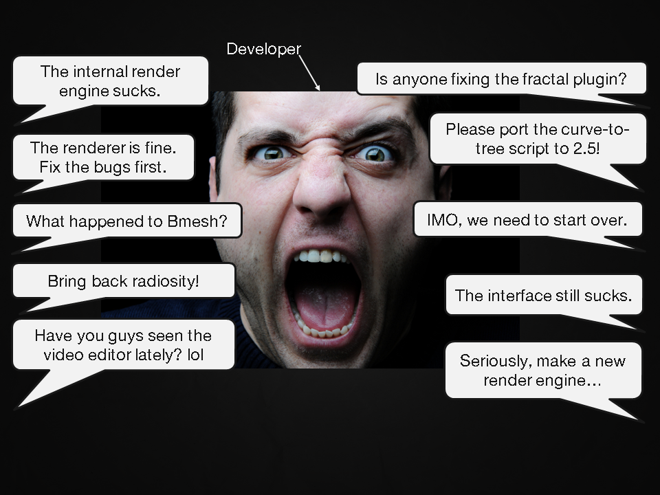
If you’ve ever been to the Blender forums before you will probably recognize this situation: Lots of people with lots of opinions.
Everyone seems to have the answer for what needs improving and not surprisingly we never seem to get anywhere. The reason for this is that there is no central voice or opinion poll to determine what the most important task is.
Businesses usually track this sort of data by distributing an opinion poll. However, for Blender this had never been done before. So in August 2010, I created “The Great Blender Survey”.
Here's a screenshot of the online survey:
The survey had one goal: To find out who is using Blender and why.
I think that if you can answer this question, then everything else will fall into place. You can determine what people are doing with blender and then develop the software to their needs.
I wanted this survey to be as accurate as possible so I exposed it to multiple parts of the community, including Blender Guru, Email subscribers, facebook, twitter and BlenderArtists.org.
I won’t claim that the survey is 100% accurate because it's not, but it's the closest I could do using the resources and connections I had available.
Over the course of 3 months I received 3,434 submissions.
Thank you to everyone who participated!
I have never released these results to anyone... until now. Ready to finally see them? :D
Let's begin...
Q1: Are you male or female?
This question was to find out if the cliché that "all 3d artists are male" was true or not.
As you can see, it’s pretty close. Guys, if you're using blender to find a girlfriend... it's an uphill battle ;)
Q2: What's your age?
This important question tells us what age most people in the community are, and finally speaks on the "maturity" issue.
As you can see, the largest age demographic for blender users are 18-24 year olds. These are the people that have just finished school and are in college or a job.
Q3: How long have you been using Blender?
This question not only tells us which year attracted the most blender users, but also how experienced we are at using the software.
From this graph you can clearly see a surge in new users over the past 12 months. This is a startling statistic as most of Blender's news, tutorials and training products are geared for experienced users.
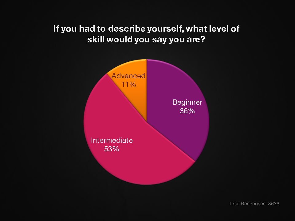
Q4: If you had to describe yourself, what level of skill would you say you are?
This question is aimed at identifying what level of skill users are at in order to cater training and tutorials to their needs.
Q5: What is your primary use of Blender?
If I could only ask one question in the survey it would be this. This question will tell us exactly why people are using blender and greatly assists us in developing the software for their needs.
The biggest demographic are clearly hobbyists, but it’s comforting to see that a good 47% of us are using Blender for commercial reasons. And I for one never expected to see so many game artists!
Q6: Have you ever used an external renderer?
This is a two part question. The first is to find out how many people are outsourcing the render process to other programs.
34% of the blender community have never used an external render engine!
Q6b: If yes, which external renderers?
This question helps identify which external renderers people are using, so that we can create intergrated exporters that meet the demands of the community.
Yafaray and LuxRenderer are the two most used render engines are amongst the blender community.
Q7: Have you ever used commercial 3d software?
Blender users love comparing blender to commercial alternatives, but how many have actually used commercial alternatives?
Surprisingly a good 74% of the community have! This is good news because it means they decided to stick with Blender anyway. We must be doing something right :)
Q7b: If yes, which applications?
Finding out which applications people have switched from helps us understand which UI layouts and keyboard shortcuts they are used to.
As you can see, 3ds Max is by far the most familiar app with Blender users.
Q8: Why did you originally start using Blender?
This question will tell us exactly what advertising methods are working the best.
Not surprisingly the biggest reason most of us tried Blender is because it's free. What shocked me though was finding that 23% of us were more impressed by seeing what Blender is capable of. This is another reason why artists should post their work on public 3d forums like CGSociety.org instead of just blender specific forums.
Q9: Can you see yourself switching to another 3d application in the next 5 years?
With the ongoing development of 2.5, many users have voiced their frustration over the stability of Blender. How likely are we to jump ship to another piece of software?
The good news is that almost ¾ of the community is here to stay! Only 1% are dedicated to switching.
>>Bonus! Find out why are they are quitting<<
Q10: What aspect of Blender needs the most improvement?
This all important question will tell us exactly what feature of blender needs the most attention.
As you can see, the internal render engine is heads and shoulders above everything else. This stresses just how important it is to keep the render engine competitive to the industry.
Q11: In your opinion what is the biggest problem with Blender?
Focusing on the bigger picture, I asked people to decide on the single biggest problem with blender as a whole.
Lack of documentation has been voiced countless times in the past but only now is it glaringly obvious.
Q12: Have you ever made money using Blender?
This tells us exactly how many people have successfully used Blender for a professional service.
As you can see, only 23% of us have ever succeeded making money with Blender.
Results
From these results we are able to work who exactly is the “typical blender user”.
Identifying who our users are and what they want is the first step in improving Blender. Hopefully this survey will help developers, studios, trainers and other professionals cater their services to the needs of the blender community.
>>Download the survey results as a PDF and Excel file<<
Issues #2: Marketing
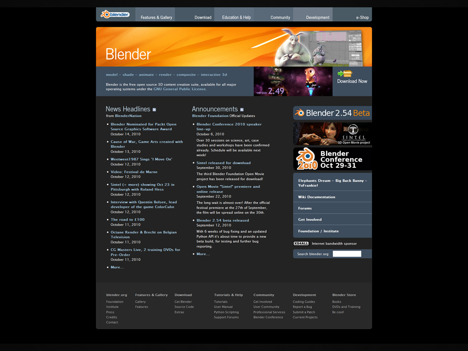
Marketing is all about how we portray ourselves to the outside world and get new users on board. For Blender the first impression that most people have is from visiting Blender.org. What the visitor sees when they arrive on this site, greatly effects whether or not they download the software.
According to the book 'Don't make me think', all visitors are at a website because they have a question and they want it answered.
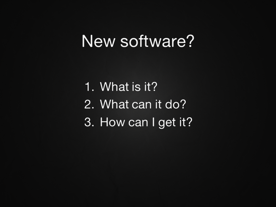
In the case of new software, it's three questions:
If you can answer these three questions on the homepage then the website is successful at giving the visitors what they came for.
Before we discuss blender though, let's first take a look at our competitor's websites.
3ds Max
An image slideshow at the top proudly shows what 3ds max can do. Underneath that is a brief description telling exactly what 3ds Max is. On the right is a Buy it now button that shows the visitor the next logical step if they like what they see. All three questions can be answered just by glancing at the homepage. Therefore, 3ds Max passes the web design test.
Octane Renderer
A similar layout: Gallery Slideshow at the top, short description underneath and a buy it now button on the side. Octane Renderer also passes the web design test.
Lightwave
Gallery at the top, description underneath and buy button underneath. Are you noticing a trend? Lightwave passes the test.
Maya
Gallery slideshow at the top, description underneatch, buy it now button on the side. Maya also passes the test.
Blender...
In fact there really isn't anything on the blender homepage that is relevant to new users.
Blender.org reads more like a hangout spot for experienced users then a doorway for new users. Which is a shame because the whole purpose of a software homepage is to convert a curious visitors into a user. Currently we are failing that.
Redesign Mockup
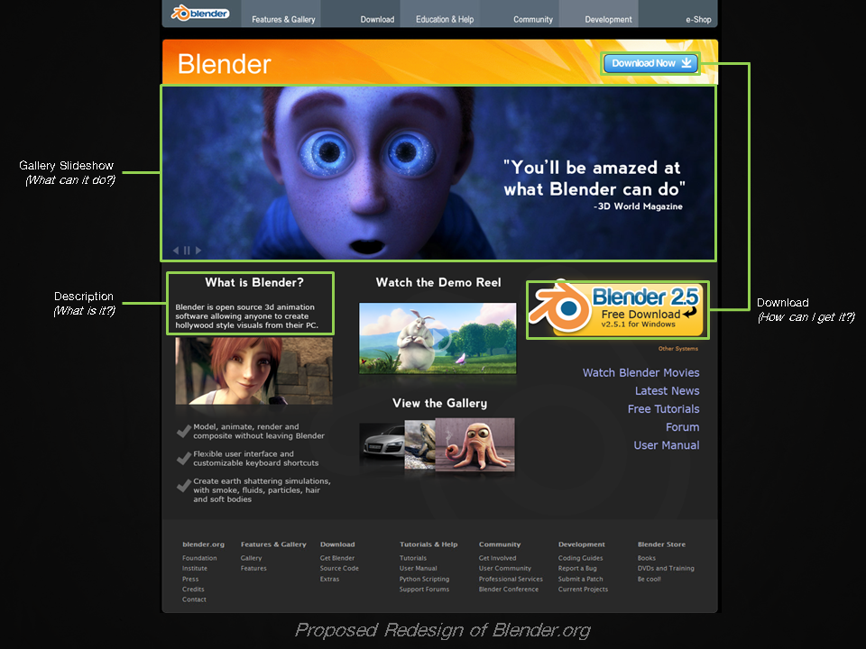
I'm not a web designer, but I've attempted my own mockup redesign of the site, using artwork from the current blender.org galley:
The whole purpose of this design to answer the three important questions that new visitors have:
The most crucial element of this design is the large image gallery at the top. Users don't want to be told why a software is a good, they want to be shown. Currently the community is posting amazing pieces of artwork on BlenderArtist.org. But unfortunately, once they slide off the frontpage they disappear forever. What a waste! Why not showcase this art directly on the homepage for the world to see?
Also featured in this site redesign are a short description, two easily identifiable download buttons and links to the gallery and demo reel. All these elements are appealing to new visitors.
Issue #3: Training
In the last 12 months we have seen two new websites emerge that are dedicated to delivering ongoing tutorials: Blender Cookie and Blender Guru.
So you may be wondering... what's the issue? Surely we have this training thing covered, right?Wrong!
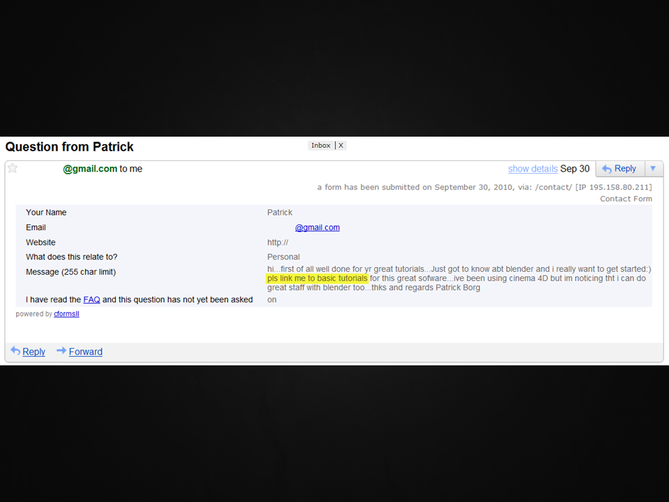
There are two problems. The first one being that training is incredibly hard to find. Experienced users know about Blender Cookie and Blender Guru, but new users don't.
An obvious solution would be to update the Blender.org tutorial page with new tutorials, but unfortunately I already did that and it hasn't solved the problem.
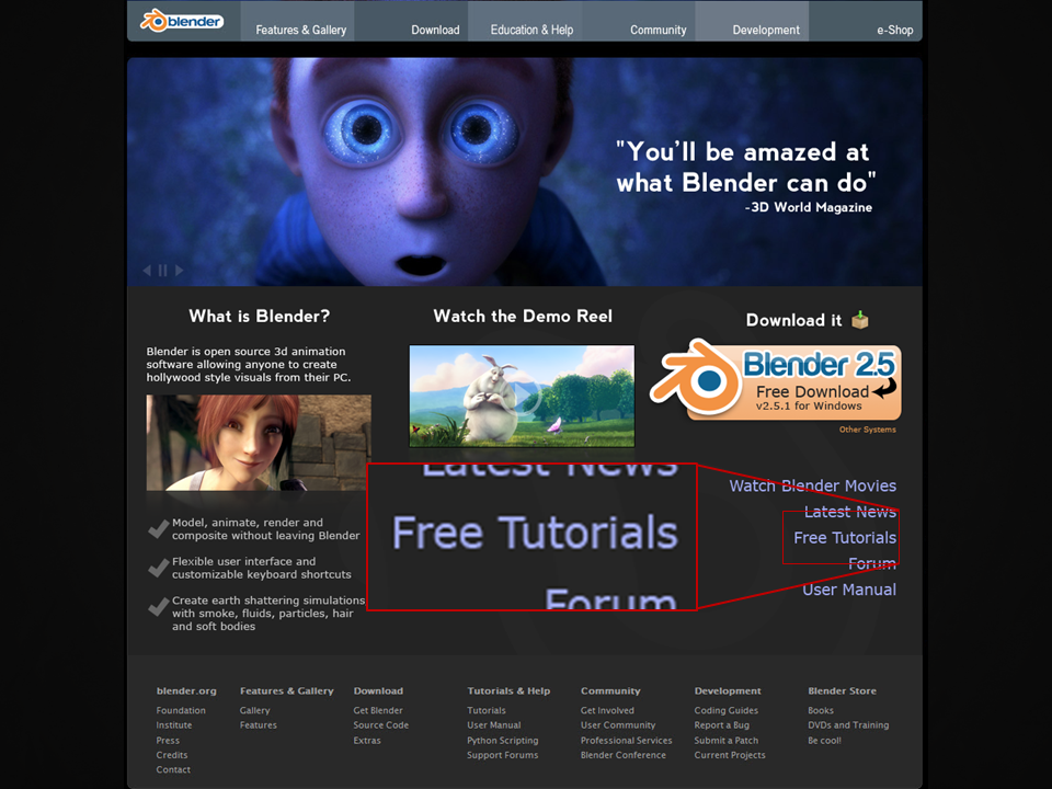
Why? Because the tutorial page is almost impossible to find! A new user does not know to click 'Education & Help' and then read a long block to text to find the link for 'Tutorials'.
Without easily accessible training new users will get frustrated with Blender and quit. We need to reference the tutorial page in as many places as possible so that new users can locate it with ease.
One place to start would be the Blender splash screen. This is the first thing new users see when opening Blender and it's the first place they get stuck. By having a clear link right on the splash that says 'Tutorials' they will know exactly where to go.
The second obvious place would be to link to the tutorial page directly on blender.org.
Believe it or not but this also persuades new users to download the software. Why? Countless marketing research has proven that if you can provide free training to a customer they are more likely to buy the product. This is one of the reasons that Adobe products ship with a training disc :)
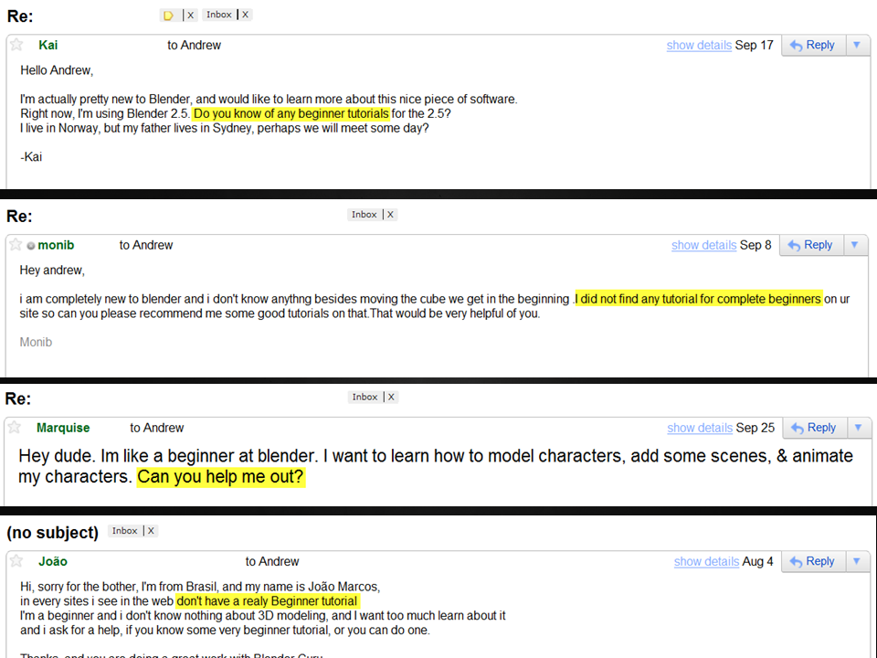
The second problem is that we have forgotten about new users!
Blender Guru makes advanced tutorials and Blender Cookie teaches techniques and tutorials at a beginner level. But there no tutorials for complete beginners. How is a new user supposed to wrap their head around the concept of 3d without a proper walkthrough?
I've decided to volunteer to solve this one. Next year I will be creating a completely free beginner training series, very similar to Video Copilot's beginner series. Stay tuned!
Issue #4: Donations
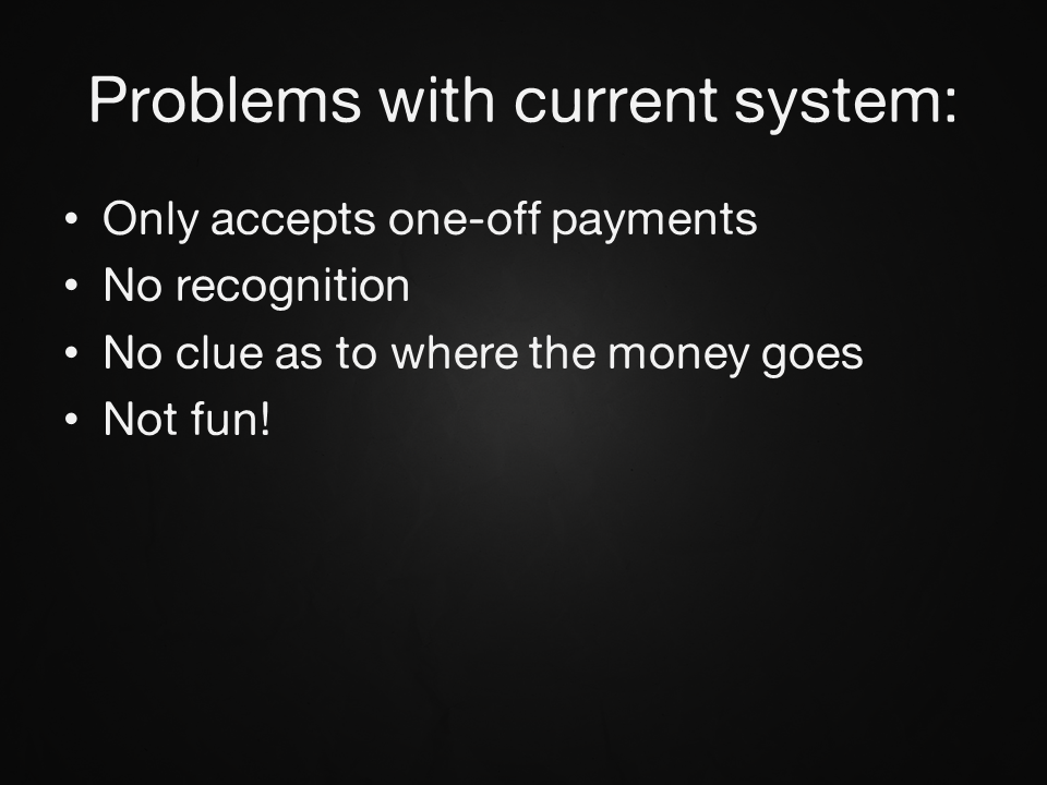
Receiving donations is crucial to the success of Blender. The more money the foundation has, the more fulltime developers Ton can hire. Unfortunately, the donation system is very lackluster:
"Well it looks like a pretty standard donation page to me. What's the problem?"
Good question. Whilst donating is fairly simple concept, there are many things that we can do improve the experience and make it more attractive to masses:
In detail:
- Only accepts one off payments - This is like shooting yourself in the foot. Dedicated blender users have asked for a way to donate on a regular basis, but currently there is no option to do this.
- No Recognition - Obviously when people donate money they are doing out of the goodness of their heart and aren't expecting anything in return. But human beings are still human beings and we crave a pat on the back. If we know that nobody will say "Thank you" for the effort, then we aren't likely to follow through with the donation.
- No clue as to where the money goes - If you donated $100 today, where would the money go? A new feature development? Bug fixes? Pay the rent on the blender institute building? If the donator does not have a 100% clear understanding of where their money is going, they won't donate. It's as simple as that.
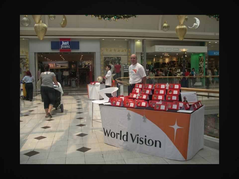
For examples of how to do donations the right way, you need to look no further than World Vision:
Now obviously Blender is not a charity but we are still asking for donations so we should not stray to far from the pros.
- World Vision donations are accepted on a monthly basis so as to ensure that the support contines all throughout the year.
- Novelty plaques are given to the donator so they can "show off" their donation to friends, family and whoever visits their house.
- Detailed descriptions show exactly how each dollar of your money is spent.
Donation Redesign
I've put together a redesign of the donation system based off these ideas:
In this redesign, people wanting to donate are given three simple monthly donation plans: Bronze, Silver or Gold (an option to donate as a once off is still available)
Detailed descriptions show exactly where each dollar is spent.
The donation plans are visualized as a trophy to make it feel like you are purchasing a product as opposed to throwing money in the air. For recognition this could be intergrated into the blenderartists.org forums:
A small trophy icon is all it takes to thank the donator for their contribution. Everytime the user makes a post, they can feel good knowing that other users are now recognizing their contribution. This small gesture will also entice other users to contribute because when they click the icon it can route them to the donations page.
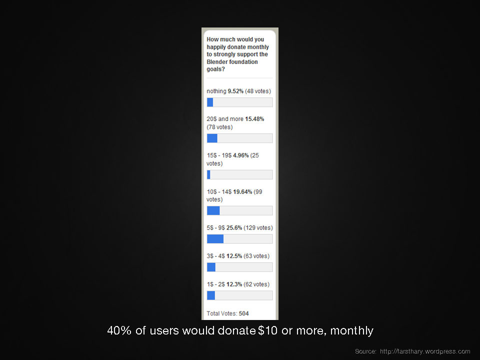
You may be wondering, "Yeah but how many people would actually want to donate on a monthly basis?". Well for that you need to look no further than Farsthary's blog. He asked his readers "How much would you donate monthly to support the Blender Foundation?"
And believe it not, but 40% said they would happily donate $10 or more on a monthly basis. Now obviously that's just a poll and not everyone who voted will actually follow through with it, but it shows that the blender community is at least supportive of the idea.
So that concludes my presentation! Thank you for reading :)
What did you think of these proposed ideas? Do you think they would help improve the progress of Blender? I am very interested in hearing your feedback. Please write a comment below!
If you like this presentation you may also like my other live presentation, "How to Raise your Profile as an Artist"


